Fintech · Frontend Engineering · Design-System Migration
Migrating Chargebacks911 website onto a Real Component System
A redesign and platform migration of the public marketing site for Chargebacks911, a fintech platform that helps merchants, issuers, and payment providers prevent, fight, and recover from card disputes. A Next.js 16 / React 19 application with a written, enforceable design system, a real component library, and dozens of bespoke, hand-animated product illustrations built from scratch in React.
Everything on this page runs rather than sitting in a screenshot. Eleven live builds: a complete solution page, eight product widgets, a light/dark comparison panel and an original dashboard concept, all ported off Next.js onto Vite so they can be scrolled and clicked right here. Nothing sends you away to open one: the full page and its dialog both run inside this page, and every way out of them lands you back where you were. The components are the ones I built. Only the data inside them is invented, because the client's is theirs.
Dispute volumes, recovery rates and dollar amounts in these builds are invented for this page. The components carrying them are the ones I shipped; the client's data and their live internal product stay where they belong.
/data-based-deflection
Start With One of the Pages, Running
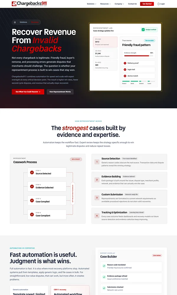
Header, hero, the four-step flow, the live deflection feed, tool cards, the integration diagram, the qualifier grid, the layered-strategy close, footer. One page, scrollable and clickable, before any of the claims below it. Every section here is the component I built for that route, ported off Next.js onto Vite without redesigning anything.
Opening it full size keeps you here too: it fills the window over this page rather than replacing it, and its header link, its dialog and Escape all return you to this section.
Live build · scroll it. The “Get Started” button opens the real slide-in modal.
Original Work
Eleven Solution Pages. Eight of Them Had No “Before”.
That page is one of eleven. Each got its own layout, its own illustrated proof moment and its own motion, rather than one template refilled eleven times. Eight of the eleven did not exist in any form beforehand. No old layout to modernize, no prior copy deck, no earlier version to sit beside.
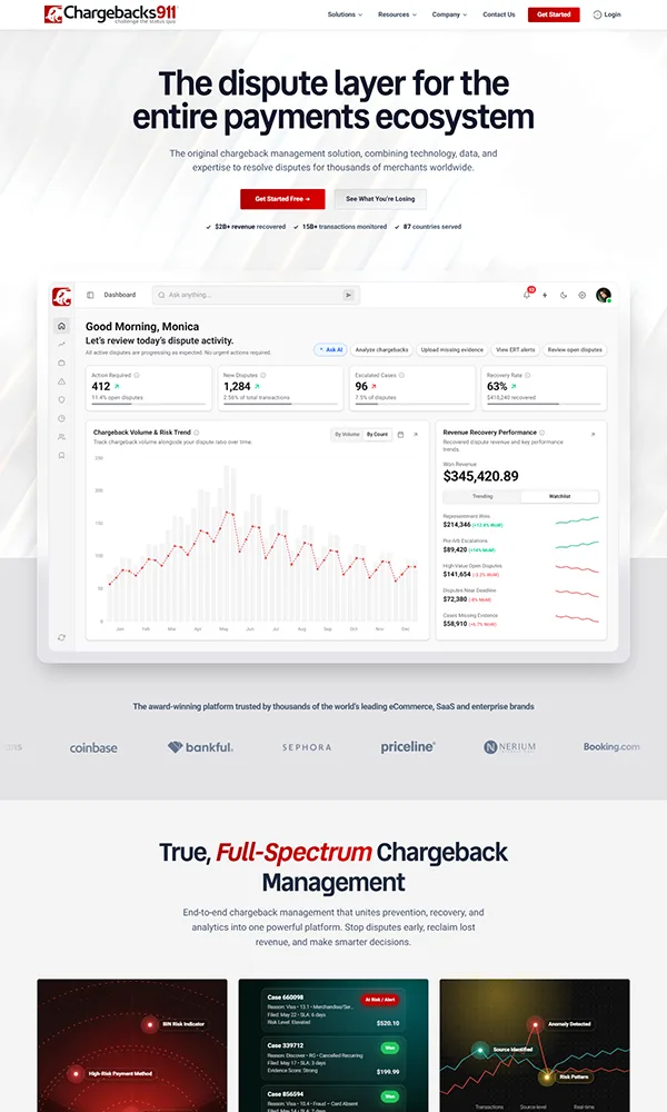
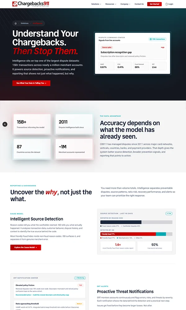
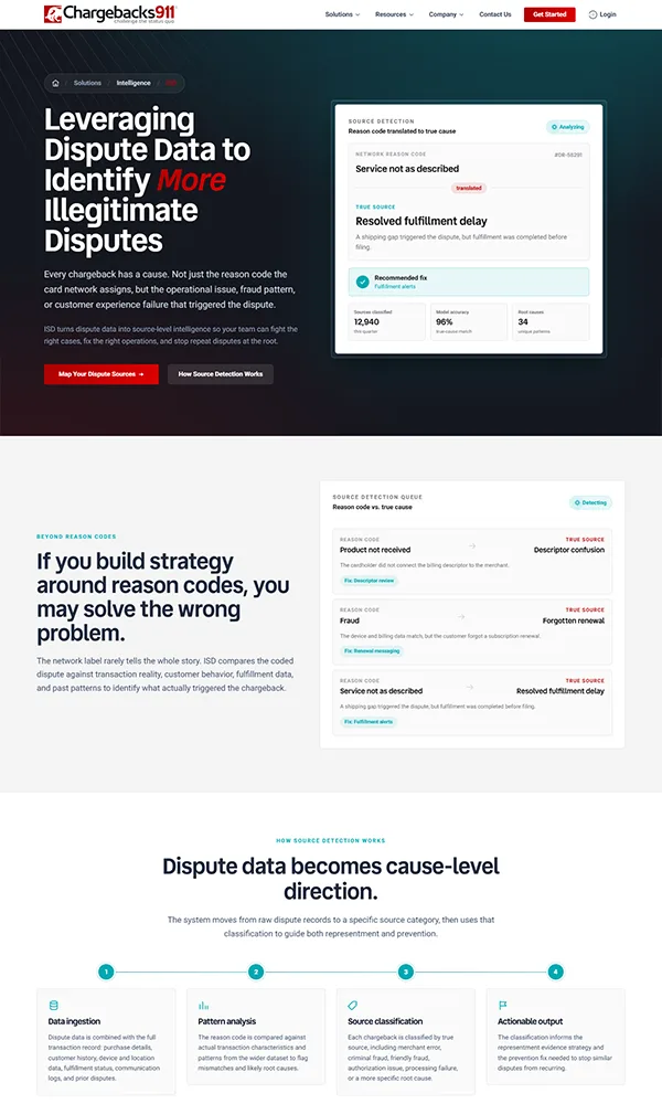
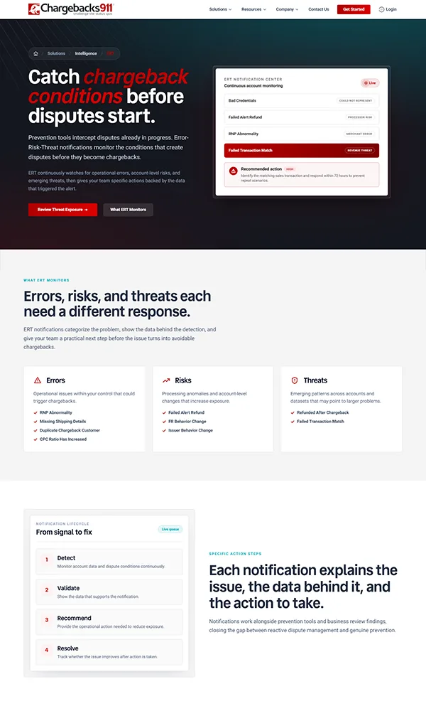
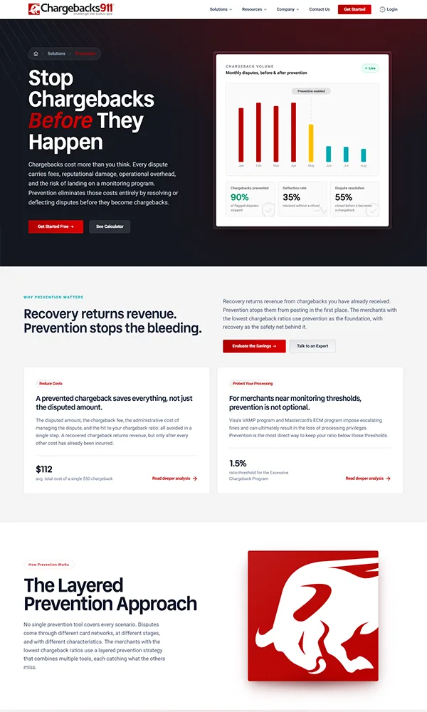
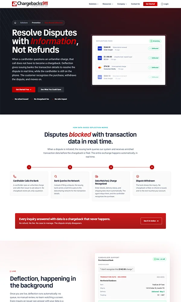
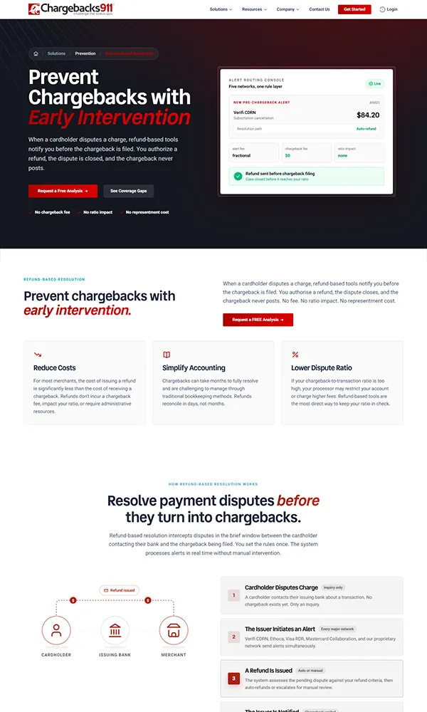
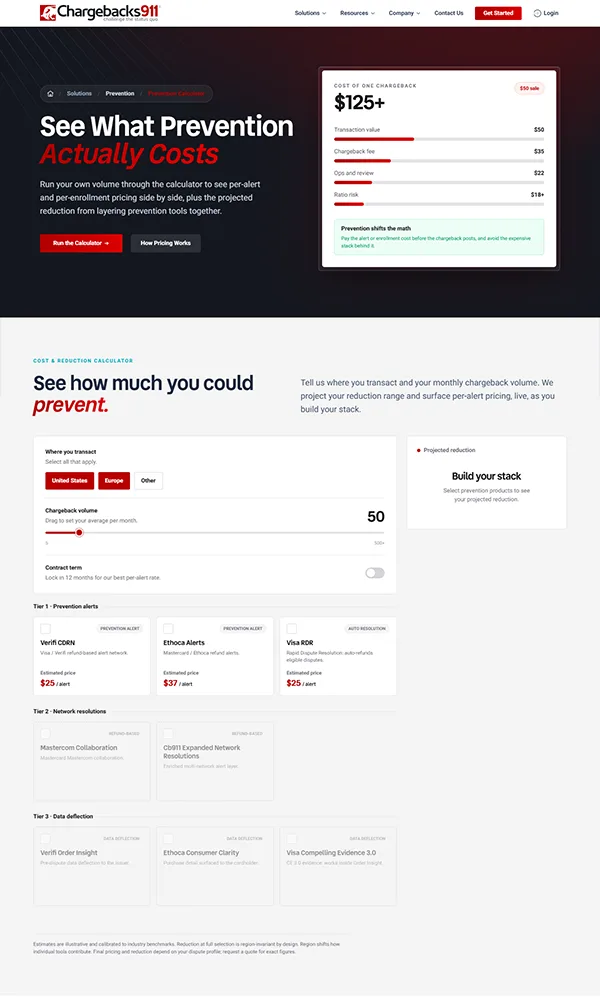
Eight of the eleven solution pages, plus the revised homepage · hover or focus an edge to pull that page forward
The Real Work
Deciding What Each Page Should Be
So the work was deciding what each page should be. What a reader needs to understand first. What order an abstract process becomes followable in. What illustration carries a data flow that has no photograph and no obvious metaphor. Every section on the live page above (the four-step flow, the deflection feed, the tool cards, the qualifier grid, the layered close) is an answer to that question rather than a restyling of someone else's answer.
The three pages with a genuine predecessor got the modernization treatment. The other eight were designed from scratch, and they are the part of this project that took the most thought.
The pages were walked through for keyboard reach, focus order and motion sensitivity before hand-off, and what that found was written down rather than quietly fixed or quietly ignored.
animated components honouring prefers-reduced-motion
- Escape closes every dialog on the site, and a click outside does the same.
- The bottom CTA banner still animates unguarded. Logged, not fixed.
The Component Library
More Than Hero Animations: a Full Redesign System
Beyond the interactive moments, the rebuild shipped a complete, reusable UI kit: a typographic scale, a button system, status badges, and card patterns that every new page is assembled from, so no page has to invent its own.
Vend Sans 700 · headings
Roboto 400 body · 600 UI
Two families, four weights between them. Vend Sans never goes past 700.
Stop chargebacks before they happen
A dispute layer for the entire payments ecosystem
Prevention, intelligence, and recovery in one platform, built for the risk, compliance, and finance teams who carry dispute strategy.
One semantic red, resolved per surface, so contrast survives the dark sections.
The token that changed most often before it settled.
How the Work Was Split
A Direction Set by the Team, Then Taken the Rest of the Way
This was a group effort with a clear division of labour. The creative director, the VP of marketing and a senior product engineer set the homepage direction and the visual language the site would speak in. The VP specified the calculator logic and the schematic diagrams: what each one had to prove, and what a merchant should walk away understanding. That gave me a strong brief and a real design law to build against, which is the part most projects never have.
From there the pages were mine to make. The homepage moved from agreed direction to shipped design, and eleven solution pages followed: eight of them designed from scratch for capabilities the old site had never given a page to, three redesigned from existing pages onto the new system. The VP's specs became live, animated components rather than static diagrams. Everything inside those pages: hero visuals, cards, section layouts, empty and active states, the motion, was designed and coded here.
- Homepage direction and visual language, with the creative director, VP of marketing and a senior product engineer.
- The product design language the solution pages had to extend.
- What each calculator and schematic needed to prove, specified by the VP.
- The design law the whole build is held to.
- The homepage, carried from agreed direction through to shipped design.
- Eleven solution pages: eight designed from scratch, three redesigned onto the system.
- Every calculator and schematic, built as a live interactive component.
- All page-level design: hero visuals, cards, sections, states and motion.
What Changed Along the Way
The Site Was Supposed to Be Much Darker
The first direction was a dark product site throughout: dark sections, dark cards, dark surfaces behind everything. It didn't survive contact with the actual content. Long explanatory copy, dense qualifier grids and multi-column comparison tables all read as heavy and unapproachable on dark backgrounds, and a fraud-prevention product already has to work against sounding intimidating.
So the direction split. The heroes kept the dark treatment, where it does what it was hired to do: a single headline, one visual, high contrast, a serious first impression. Everything below them moved to light, and the cards and content sections became friendlier as a result. What survives on the page today is that compromise, not the original plan.
The dark work wasn't thrown away. The dashboard concept still carries a full dark theme, which is why its top bar opens with a sun-and-moon switch: it's the one place the original direction still exists end to end.
Palette was the loudest change, but not the hardest. That was disclosure. A risk officer only buys once the mechanism is concrete, and every schematic that makes deflection concrete also tells a competitor how to build it. Each diagram was drawn, cut back and drawn again against that line: enough to be provable, not enough to be copied. It shaped the illustrations more than any style decision did, which is why it heads the list below.
Every schematic that proves the mechanism also hands a competitor the method. Each one was redrawn against that line.
The shaders and background treatments were rebuilt several times. This is the single element that changed most across the project.
Went back and forth on scale more than once. Too large and the pages felt like slideware; too tight and the dense pages stopped breathing.
Changed repeatedly before the token settled. Every change had to cascade through the whole component set at once, which is exactly the argument for having a token in the first place.
Live build · the dashboard's own recovery panel, cycling. Click the switch to take it over. Dark was the original plan for the whole site.
The Company
The Dispute Layer for the Entire Payments Ecosystem
Chargebacks911® is the original chargeback management company: technology and expertise that resolves disputes for merchants worldwide, across three pillars: Prevention (stopping disputes before they're filed), Intelligence (the data and reason-code analysis behind why disputes happen), and Recovery (representment and revenue recovery on invalid chargebacks), spanning merchants, acquirers, issuers, and payment facilitators.
-
Prevention
Stopping disputes before they’re ever filed. -
Intelligence
The data and reason-code analysis behind why disputes happen. -
Recovery
Representment and revenue recovery on invalid chargebacks.
The three pillars as the site's own header menu presents them.
Why a Redesign
A Fintech Site That Has to Look as Trustworthy as the Product It's Selling
The audience is risk officers, compliance teams and finance leads at merchants and issuers: people who buy on evidence. The site's job is to make an abstract product (dispute data pipelines, card-network integrations, an expert-services layer) concrete enough to be judged. Stock imagery cannot do that, so every solution page earns its own illustrated proof moment: an animated chargeback-decline chart for Prevention, a live call simulation for Data-Based Deflection, a signal console for Intelligence, a case-file lab for Recovery. All of it hand-built React.
The tree beside this is the repository that came out of it. Eleven modules under src/components/sections, each a folder of components rather than a page file: deflection/ alone is nine components plus its own data module, compliance/ is eight plus a thresholds table, prevention/ another eight plus a rules module. Shared primitives sit in ui/, cross-page behaviour in hooks/, and the design law with its audit trail in docs/. None of this is a page-builder block or a theme template: it is a React application structured like one, which is why a twelfth page is days of work rather than weeks.
The .data.ts files scattered through that tree are the other half of the decision. Copy, card contents, qualifier lists and threshold tables live in their own modules beside the components that render them, not typed into the markup: deflection.data.ts, industries.data.ts, steps.data.ts, alertSources.ts, thresholds.ts, plus JSON for the ERT notifications, the trust badges and the ROI scenarios. Editing a headline means changing one line of data rather than reading a component, which is the difference between the next person maintaining these pages and rebuilding them.
- src
- app
- globals.css
- layout.tsx
- page.tsx
- robots.ts
- sitemap.ts
- components
- layout
- Footer.tsx
- Header.tsx
- SiteNav.tsx
- sections
- calculator
- calculator.types.ts
- PreventionCalculatorContent.tsx
- compliance
- ComplianceCalculator.tsx
- ComplianceHero.tsx
- ComplianceMastercardExplained.tsx
- ComplianceOtherNetworks.tsx
- ComplianceOverview.tsx
- CompliancePillars.tsx
- ComplianceTrust.tsx
- ComplianceVisaExplained.tsx
- thresholds.ts
- deflection
- deflection.data.ts
- DeflectionClose.tsx
- DeflectionFit.tsx
- DeflectionHero.tsx
- DeflectionHowItWorks.tsx
- DeflectionIntegration.tsx
- DeflectionLiveFeed.tsx
- DeflectionStepsSection.tsx
- DeflectionTools.tsx
- LayerDiamondStack.tsx
- industries
- ChargebackTypesAccordion.tsx
- industries.data.ts
- IndustryContent.tsx
- intelligence
- ert-data.ts
- ert-notifications.json
- ERTSampleNotifications.tsx
- IntelligenceChildContent.tsx
- IntelligenceContent.tsx
- PreventionImpactStack.tsx
- prevention
- EarlyIntervention.tsx
- HowItWorks.tsx
- IntegrationNetworks.tsx
- LayeredApproach.tsx
- layeredPrevention.js
- LayeredPreventionTool.tsx
- PreventionAudit.tsx
- PreventionHero.tsx
- WhyPreventionMatters.tsx
- recovery
- RecoveryContent.tsx
- RepresentmentSteps.tsx
- refund
- alertSources.ts
- RefundContent.tsx
- RefundHero.tsx
- roiCalculator
- RoiCalculatorContent.tsx
- roiEngine.ts
- scenarios.json
- steps
- StepItem.tsx
- Steps.tsx
- steps.data.ts
- trust
- badges.data.json
- TrustBadges.tsx
- TrustContent.tsx
- calculator
- ui
- Badge.tsx
- Button.tsx
- Card.tsx
- GlassPill.tsx
- layout
- hooks
- useMediaQuery.ts
- useReducedMotion.ts
- useScrollProgress.ts
- lib
- analytics.ts
- cn.ts
- format.ts
- styles
- tokens.css
- types
- dispute.ts
- index.ts
- app
- docs
- AGENTS.md
- DECISIONS.md
- design-system.md
- FLAIR-REGISTRY.md
- .gitignore
- eslint.config.mjs
- next.config.mjs
- package.json
- postcss.config.mjs
- README.md
- tailwind.config.ts
- tsconfig.json
The real repository, folders collapsed. Click any one to open it.
Process
A Written Design Law, Enforced Collaboratively With an AI Agent
Rather than a static Figma-to-code handoff, this project ran on a written, machine-readable design law (docs/design-system.md + styles/tokens.css). An AI coding agent (Claude Code) handled the organizational heavy lifting of applying it: inventory the whole codebase against the rules, fix everything with exactly one correct answer automatically, then surface every genuine judgment call back to me one at a time with a recommendation attached. I made every real decision; the agent did the mechanical work at scale and kept the audit trail. Nothing was silently "cleaned up."
Tier 1 · Mechanical
One Written Law the Whole Site Is Held To
The design system is not a swatch page. It is a document with numbered rules covering colour tokens, the type scale, radii, spacing, buttons, cards, motion and iconography, and every page on the site is measured against it. That is what let eleven pages ship looking like one product: the eight designed from scratch and the three redesigned from the old site answer to the same rules, not to the same mood board.
Anything the law defines unambiguously gets corrected automatically and cascades from the shared component, so a ruling is made once and lands everywhere: button radius, the arrow law, gradient-fill headline text, em dashes in rendered copy, and six rounds of raw-hex-to-token sweeps (brand red across 27 files, grayscale across 17, near-black surfaces unified across 9). None of that needed a question, because the answer was already written down.
docs/design-system.md
# Design lawEvery rule below is binding on every page. Exceptions arenamed in FLAIR-REGISTRY.md, never assumed.## 1. Colour tokens brand, grayscale, surfaces## 2. Type scale families, sizes, weights## 3. Radii 3px controls / 6px cards## 4. Spacing 4px base, no ad-hoc values## 5. Buttons primary, secondary, ghost## 6. Cards + panels borders, shadows, fills## 7. Arrow law direction, two carve-outs## 8. Motion durations, easing, reducedThe contents page of the project's real design law. Eight numbered sections, each one enforceable.
Tier 2 · Judgment Calls
One Question at a Time, Always With a Recommendation Attached
Anything the design law didn't spell out, or anything that looked intentional rather than accidental, got escalated as a numbered question with the agent's own recommendation attached. The decision is to accept it, override it, or park it. "Parking" is always safe: the element stays exactly as it looks, logged for a later look, never silently normalized.
| Question | Ruling |
|---|---|
Two near-identical near-blacks (#0e0e11 vs #0A0C10) used for different roles |
Unify onto bg-surface-dark across 9 files, overriding the agent's own recommendation to park it |
13 files hand-roll frosted glass duplicating GlassPill |
Leave as-is, not extracted into a shared component |
| Remaining raw-hex tail, ~24 instances, no exact token match | Guessed reasonable tokens anyway rather than leaving it; one new token (surface-dark-2) added |
PrimaryButton arrow drawn at 45°: intentional "opens externally" affordance? |
No exception. Arrow law fix stands unconditionally |
Excerpted from docs/DECISIONS.md, the project's real audit trail: 15 rulings across two rounds.
Flair Registry
The System Standardizes the Core. It Doesn't Flatten the One-of-a-Kind Moments
A handful of bespoke, high-fidelity illustrations are explicitly protected from normalization: the homepage dashboard preview, the Recovery page's representment-steps animation, and the canvas-driven "Unified Approach" background (built from an external design handoff explicitly marked "do not re-tune"). Each is catalogued in docs/FLAIR-REGISTRY.md with exactly which rules it's allowed to bend and why, rather than silently exempted.
What Got Built
The Highlights
A selection of the bespoke React widgets shipped across the solution pages, each embedded live below.
Every figure inside these widgets and the Meridian dashboard further down is invented sample data, not Chargebacks911's reported metrics.
/prevention
Taking the Bar Animation Away From Recharts
A Recharts ComposedChart with its default bar animation switched off (isAnimationActive="false") and replaced by a custom shape: a motion.rect that grows in on its own staggered delay per bar. That hand-off is what lets the chart respect prefers-reduced-motion uniformly with the rest of the page, instead of relying on Recharts' separate, harder-to-gate animation API.
ReferenceLine marks the month prevention "switches on": bars before it are brand red (high chargeback volume), the line's month is amber, everything after fades to green as volume declines. Color itself carries the before/after story, no legend needed.
Live build · Recharts + Motion, custom animated bar shape
/refund-based-resolution · /data-based-deflection
Two Routes to the Same Ending: No Chargeback
The refund-based path cycles through four real pre-chargeback alert sources (Verifi CDRN, Ethoca Alerts, Visa RDR, Cb911 Alerts) with an AnimatePresence cross-fade. It closes on the banner that is the whole argument: the refund went out, and the track underneath it shows how far ahead of the 24-hour filing window it landed. The hours to spare change with the alert, because which network raised it is what decides them.
The deflection path is a live "cardholder calls the bank" simulation: a chat bubble raising a disputed charge, then the enriched transaction data itself, laid out as the receipt the cardholder never kept: descriptor, order, delivery, who signed for it, which device, which card, down to a torn-off total that matches the charge on the call. That dispute is settled with information rather than a refund, before it can ever become a chargeback.
Live build · Motion staggered timeline & AnimatePresence cross-fade
/intelligence · /ert · /isd
One Component, Three Pages, Three Different Moments
Two child pages share one component with a kind prop, each rendering a different “moment”: ERT holds a threat-monitor queue where the live row carries its own severity and the action it calls for, ISD translates a raw network reason code into its true root cause. Both run on the same clock and both show it: the hairline under the header is the rotation itself, and hovering freezes it where it stands rather than winding it back, so nobody loses a case mid-read.
The parent Intelligence hero cycles account-level signals instead, each one tagged with what kind of signal it is and what to do about it, over a volume trend and a root-cause split. The ERT page also ships a genuinely functional notification browser, not a mockup: filterable cards, a detail dialog, and a "mark as resolved" flow that persists resolved IDs to localStorage and animates a green pulse before closing.
Live build · all 3 route variants. Hover to hold a rotation. The figures inside are invented sample data.
/recovery
A Case Queue You Can Actually Click Through
RecoveryCaseLab pairs a clickable case queue with an AnimatePresence detail panel: true source, an animated evidence-strength bar, an evidence checklist, and the four-stage pipeline underneath tracking how far that case has actually got. It runs on its own timer and yields to a click. Below the hero, a fully bespoke, protected-flair illustration walks four casework stages connected by a hand-tuned SVG "spine" that a glowing dot travels along, triggered once by an IntersectionObserver at 25% visibility.
The four stages, as labels. RepresentmentSteps.tsx itself is protected flair: its hand-tuned SVG spine and traveling glow dot are catalogued as untouchable, so they aren't rebuilt here.
Live build · clickable queue + AnimatePresence detail panel. Pick a case; the pipeline below follows it.
Homepage · Unified Platform
A Shared Canvas That Reads Its Own DOM to Stay Correct Across Resizes
Instead of hardcoding coordinates, the canvas layer reads each connector's live getBoundingClientRect() every frame to place its traveling "signal" balls, so the physics never drifts out of alignment on reflow. Each ball has independent speed and size and trails a short comet tail, with edge fade over the last 12% of its travel. Device-pixel-ratio canvas sizing is capped at 2x, and frame delta-time is clamped to 50ms so a throttled background tab doesn't cause the animation to jump on return.
Get Started · Every Page's Ending
The Conversion Surface Is a Component Too
Every solution page ends in the same ask, so the demo request is one component mounted once at the root rather than a page. Any button on the site raises it through a small external store, which is why the header CTA, the mid-page banner and the closing block open the same dialog instead of three near-copies drifting apart. It arrives as two panels from opposite edges, and closed it carries inert, so its fields stay out of the tab order entirely.
Because it is a component and not a page, it can be shown as one. The button beside this mounts the dialog on its own, over this page, with nothing rendered behind it and no wait for it to arrive. Its close button doesn't leave you on a marketing page you never asked for: it hands you back to this section, and so do Escape and a click on the backdrop.
Two panels from opposite edges, over the page you are reading. Nothing behind it, nothing to wait for.
- Escape, the backdrop and the close button all return here
- Closed, it carries
inert - The form fields are decorative
The real dialog, mounted on its own. It is the same component every CTA on the site raises.
Responsive by Construction
Built Mobile-First, Never Just Shrunk Down
This is the same complete page from earlier, running at a 500px viewport. Nothing here is a separate mobile build: every layout starts single-column and earns its extra columns upward, one breakpoint at a time.
Four breakpoints do all the work. The panel beside it lists every rule that fires between a phone and a desktop on this one page: where the nav collapses, where the hero stops stacking, where each grid folds, and where the headline drops a full 24px.
<header class="fixed inset-x-0 top-0">
  <nav class="hidden xl:flex"> 1
  <button class="xl:hidden"> 1
</header>
<section class="hero">
  <div class="flex flex-col lg:flex-row"> 2
    <h1 class="text-[44px] lg:text-[68px]"> 3
    <div class="deflection-feed-card">…
</section>
<section class="steps">
  <div class="grid grid-cols-1 lg:grid-cols-4"> 4
</section>
<section class="fit">
  <div class="grid-cols-1 lg:grid-cols-2"> 5
  <div class="grid-cols-1 sm:grid-cols-2 lg:grid-cols-4"> 6
</section>
Device-mode preview: the same live page at 500px, next to every breakpoint rule that fires on it. Numbered markers tie each rule back to the element it governs.
Designed for This Showcase
Meridian: a Live, Interactive Dashboard Concept
Marketing pages prove one half of frontend work. A dense, stateful application interface proves the other. Meridian is my design for that half: its own identity and navigation, a two-mode chart, a live recovery panel, an animated case queue, and a full dark theme carried end to end. It takes the problem domain, not Chargebacks911's product, which stays where it belongs.
Stack
Bleeding-Edge on Purpose
Next.js 16 and React 19 both shipped breaking changes from what most tooling (and most AI training data) still assumes; the live project's own AGENTS.md flags this explicitly so any agent touching the repo reads the vendored docs before writing Next.js code, rather than pattern-matching stale APIs.
The framework earns its place rather than sitting in the tech list. Every page is prerendered at build time, so a visitor is served static HTML: fast, cheap to host, and trivial to crawl. The module folders in the tree above are the routes themselves, which is what keeps a page's components, its data file and its URL in one place instead of scattered across a global directory. And robots.ts and sitemap.ts generate the robots.txt and sitemap.xml from that same route tree, so a redesign of this size couldn't quietly drop pages out of search: the thing most likely to go wrong on a rebuild, handled by the build rather than by a checklist.
By the Numbers
Counted from the repository at time of writing.
The Result
A marketing site that looks as trustworthy as the fraud-prevention product it's selling: one written design law instead of tribal knowledge, a real React component library, and dozens of hand-built product illustrations in place of stock imagery. The build itself became a case study in its own right: an AI agent doing the mechanical, unambiguous cleanup at scale while every genuine judgment call still landed on my desk, logged and attached to a recommendation, never silently decided for me.
Review the full example page