Healthcare · Interactive Questionnaire
A Questionnaire That Doesn't Feel Like One
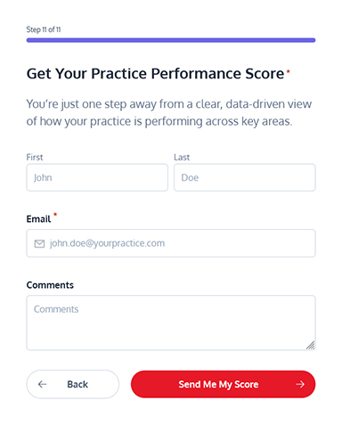
I built the frontend for a performance questionnaire that gives practices a quick snapshot of how they’re doing. Beyond delivering a clean user experience, the form also serves as a gentle lead-generation tool — helping the team identify engaged prospects without interrupting the user’s flow.
The Problem
The Challenge
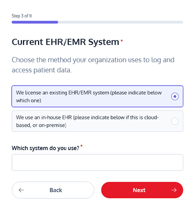
CareFlow needed the questionnaire to double as a lead-qualification tool without ever feeling like one. That meant compressing eleven questions — organization type, EHR system, patient intake method, claim denial rate, reporting cadence, priorities — into a flow that reads like three or four, not eleven.
Every question also had to branch. Picking “Other” on a dropdown, a radio group, or a checkbox list needed to reveal a follow-up field instantly, with no page reload and no framework holding the state together — just the markup, a progress bar, and a scoring model that had to update live as answers came in.

Did My Part
- Frontend architecture: Structured the form logic, components, and layout so the questionnaire feels lightweight and easy to move through.
- Interactive flow: Implemented the step-by-step question progression, score handling, and transitions to keep the experience clear and fast.
- Responsive UI: Ensured the entire form adapts cleanly across devices, with consistent spacing, typography, and alignment.
- Micro-interactions: Added small touches (validation, smooth transitions and clean navigation) to make the form feel polished without overcomplicating it.
- Performance & stability: Optimized scripts and markup so the questionnaire loads quickly and behaves predictably under different conditions.
Straight from the source
// keeps the step count and progress bar in syncfunction updateProgressBar($form, current, total) { const percent = Math.round((current / total) * 100); $form.find('.gf_step_current_page').text(current); $form.find('.gf_step_page_count').text(total); const $percentEl = $form.find('.gf_progressbar_percentage'); $percentEl.css('width', percent + '%'); $percentEl.find('span').text(percent + '%');}function syncRightPanelToCurrentPage($form){Eleven steps. One function keeping them feeling like a single, continuous flow.
The Build
Under the Hood
Every branching question in the form runs through the same small pattern: a bindReveal() helper that watches one field and toggles another the moment the answer changes. It’s the same handful of lines doing the work in four different places — the organization-type dropdown, the EHR radio group, the reporting-frequency checkboxes, and the focus-area checkboxes — instead of four separate one-off handlers.
Below is that exact pattern, drawn from the “Primary Focus Areas” question and wired up to actually work. Check “Other” and watch the follow-up field appear — no page reload, no framework, just a change listener and a display toggle.
Live snippet
One Helper, Zero Dependencies
bindReveal() is five lines: watch a trigger field, evaluate a condition, toggle a display property. The same function covers all four conditional fields in the form, so there's no virtual DOM, no state management library, and no build step between the code and the browser — just what the form needs, which keeps page weight down on a form whose job is to convert.
The trade-off shows up as the form grows: each new conditional field means another manual call to bindReveal(), wired up by hand. That's the practical case for a framework like React — worth reaching for once the number of interdependent fields outgrows what one helper can comfortably cover.
- No framework runtime added to a page built around conversion, no code volume
- One reusable helper instead of four separate event handlers
- No build step — edit the markup, refresh, done
- Total JS footprint scoped to exactly what the form needs
The whole trick, in five lines
function bindReveal($trigger, $target, test) { function update() { $target.toggleClass('is-open', test()); } $trigger.on('change', update); update();}Same helper, four call sites — organization type, EHR system, reporting frequency, focus areas.

Additional Details
To make the questionnaire more engaging and intuitive, I implemented small, subtle animations that guide the user through the experience. For example:
- Rotating doctor reviews: Testimonials or reviews switch on the side in a smooth, eye-catching way, adding credibility without interrupting the flow.
- Animated performance gauge: The scoring display updates dynamically as users progress, providing immediate feedback and helping them understand what to expect.
These details don’t just look nice - they make the form feel more responsive, help users stay oriented, and reinforce the overall sense of progress. By combining these micro-interactions with a clean, simple layout, the questionnaire becomes both pleasant to use and easy to understand.
Result
A fast, responsive questionnaire that feels effortless to complete while quietly supporting the company’s marketing goals. Users get a clear performance snapshot; the business gets high-quality, intent-driven leads. Behind the scenes, the frontend is organized, scalable, and easy to extend.
